Time series analysis is a powerful tool that allows businesses to find patterns and trends in their data over time. For bike rental companies, understanding these patterns can lead to better resource allocation, optimized operations, and enhanced customer satisfaction. In this blog, we will explore how to perform a comprehensive time series analysis on a bike rental dataset. We’ll cover everything from getting started to developing hypothesis questions and key performance indicators (KPIs) that can benefit your business.
Table of Contents
Toggle1. Theoretical Foundations
Understanding Time Series Data
Time series data is a sequence of data points collected or recorded at specific time intervals. It is crucial to identify and analyze patterns, trends, seasonality, and cyclic behavior in this data to make informed business decisions.
2. How to Approach Data Analysis
Step 1: Define the Objective
Before diving into data analysis, it’s important to define the objective. What are you trying to achieve? For a bike rental company, the objective could be to understand rental patterns, optimize bike availability, or increase customer satisfaction.
Step 2: Data Collection and Preparation
The first step in any data analysis project is to collect and prepare your data. For our bike rental analysis, we have a dataset that includes information on bike rentals, weather conditions, dates, and holidays etc. Click here to Download Dataset
a. Import Libraries and Load the Data::
# Import Libraries
import pandas as pd
import matplotlib.pyplot as plt
import seaborn as sns

# Load the data
file_path = 'SeoulBikeData.csv'
data = pd.read_csv(file_path, encoding='latin1')

# Display the first few rows of the dataframe
data.head()

b. Get Information About the Data:
It’s important to understand the structure of your dataset. The info method provides a concise summary of the DataFrame, including the number of non-null entries and data types.
# Get a concise summary of the DataFrame
data.info()
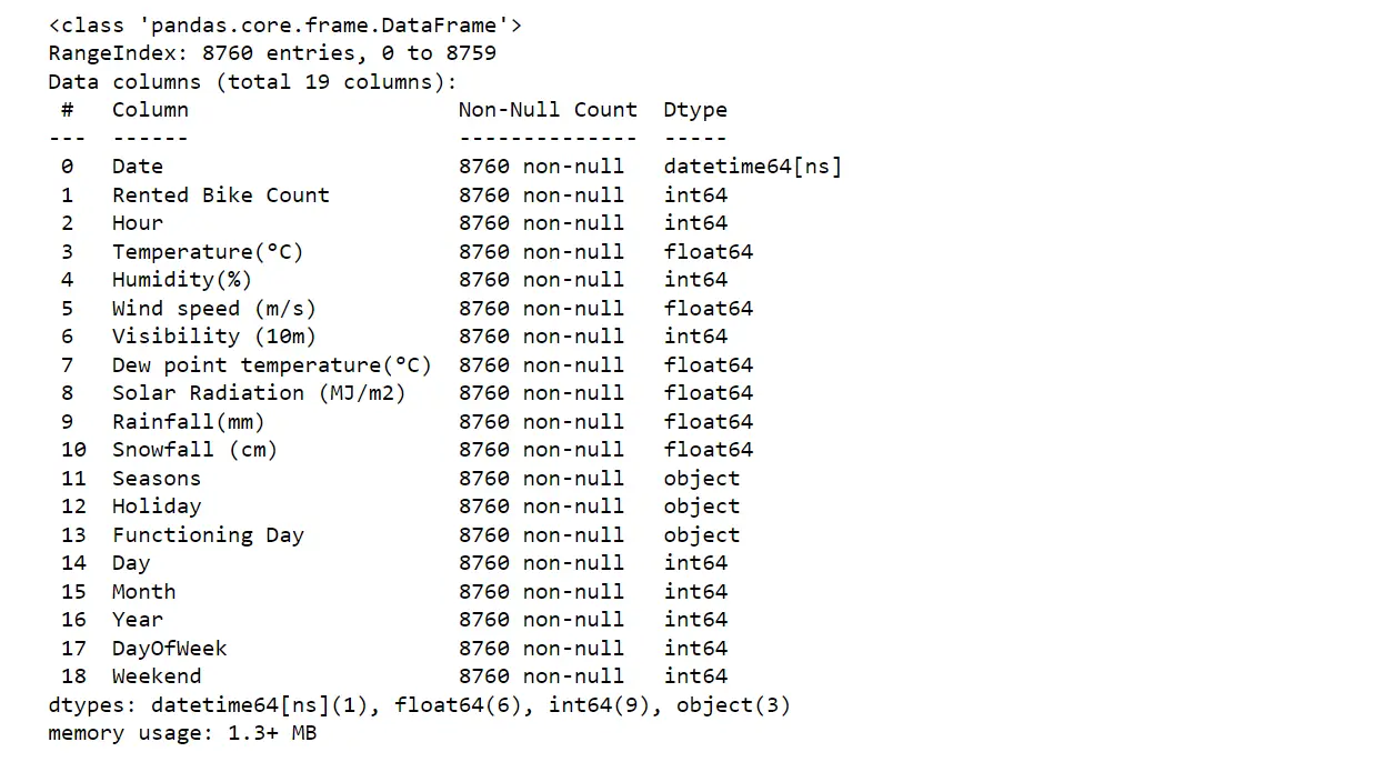
You should see information about the number of entries, column names, non-null counts, and data types. This helps you understand if there are any missing values or data type issues that need to be addressed.
c. Descriptive Statistics:
Descriptive statistics give you an overview of the central tendency, dispersion, and shape of the dataset’s distribution. This is a crucial step to get a quick summary of the data.
# Get descriptive statistics
data.describe().T
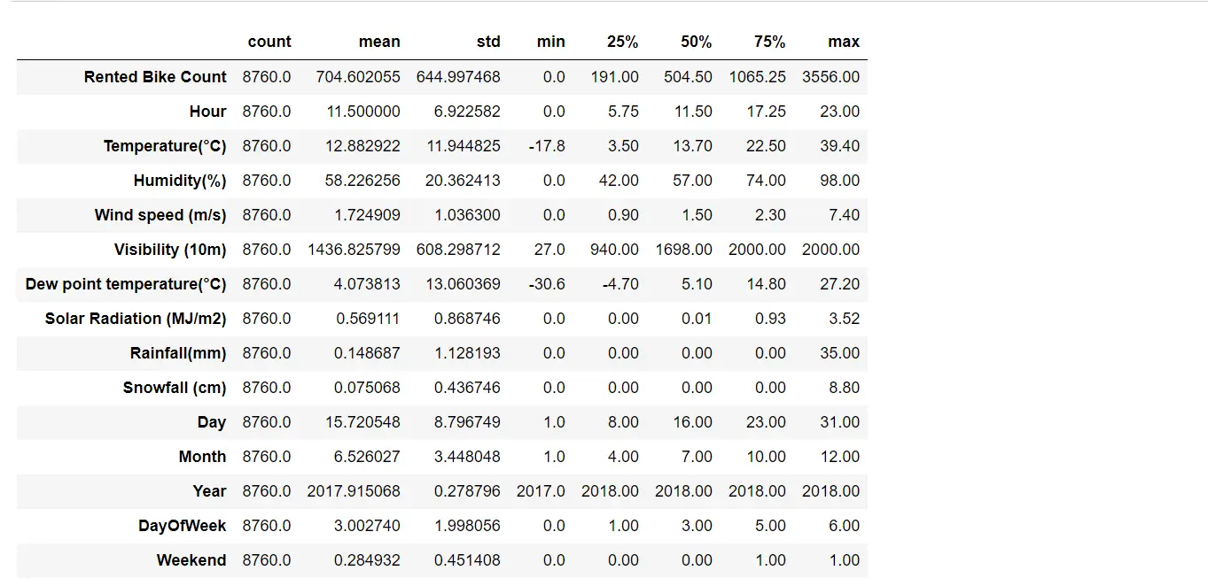
Analysis Report:
- The
Rented Bike Counthas a wide range with a maximum of 3556 and a minimum of 0, indicating high variability in bike rentals. - The average temperature is around 12.88°C, with a range from -17.8°C to 39.4°C.
- The data includes various weather conditions, with humidity ranging from 0% to 98%.
3. Exploratory Data Analysis (EDA)
Exploratory Data Analysis (EDA) is a critical step in the data analysis process. It allows you to understand the underlying structure of your data, identify patterns, detect anomalies, and test hypotheses. EDA helps in cleaning the data, choosing the right models, and making informed decisions.
What Can We Get from EDA?
- Understanding Data Distribution: EDA helps in understanding the distribution of data, such as the central tendency and dispersion, which are essential for further analysis.
- Identifying Patterns and Trends: Through visualizations, you can spot patterns and trends that might not be apparent in raw data.
- Detecting Outliers: EDA allows you to identify and handle outliers that could skew your analysis.
- Formulating Hypotheses: By exploring the data, you can generate meaningful hypotheses to guide your analysis.
Step 3. Visualizing the Data
Visualizations help in identifying patterns and trends in the data.
i) Line plot for Rented Bike Count over time
Before visualization, let’s Ensure that there are no missing values and that the data types are correct. Convert the date column to datetime format and create additional time-related features like day of the week and month.
# Convert Date column to datetime format
data['Date'] = pd.to_datetime(data['Date'], format='%d/%m/%Y')

# Create additional time-related features
data['Day'] = data['Date'].dt.day
data['Month'] = data['Date'].dt.month
data['Year'] = data['Date'].dt.year
data['DayOfWeek'] = data['Date'].dt.dayofweek
data['Weekend'] = data['DayOfWeek'].apply(lambda x: 1 if x >= 5 else 0)
This step converts the ‘Date’ column to datetime format and adds new columns for day, month, year, day of the week, and weekend indicators.
# Line plot for Rented Bike Count over time
plt.figure(figsize=(14, 6))
plt.plot(data['Date'], data['Rented Bike Count'], label='Rented Bike Count')
plt.xlabel('Date')
plt.ylabel('Rented Bike Count')
plt.title('Rented Bike Count Over Time')
plt.legend()
plt.grid(True)
plt.show()
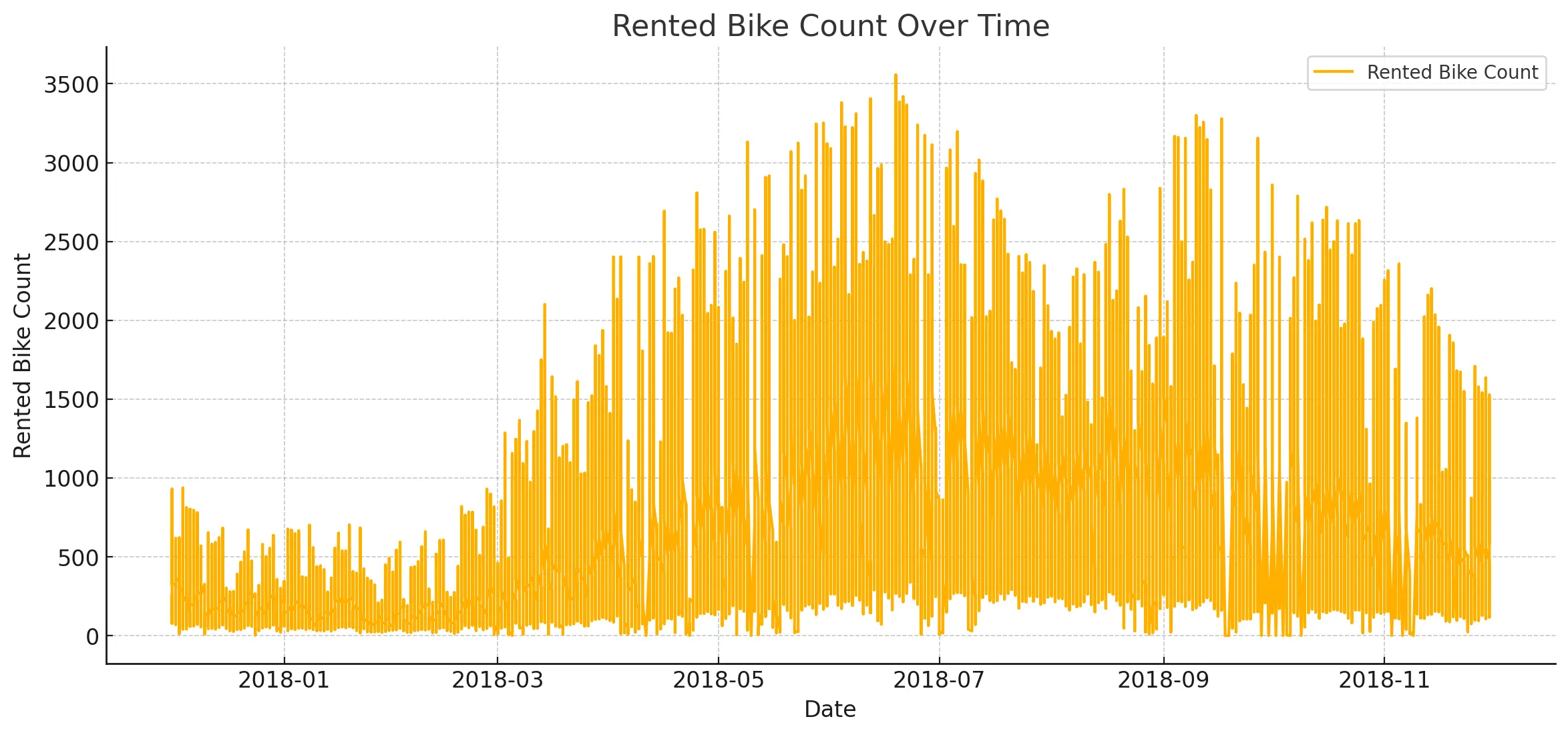
Analysis Report:
- The line plot shows a clear seasonal pattern in bike rentals, with peaks and troughs indicating variations over time.
ii) Distribution Of Bike Rentals Across Different Hours
# Box plots to analyze the distribution of bike rentals
plt.figure(figsize=(14, 6))
sns.boxplot(x='Hour', y='Rented Bike Count', data=data)
plt.xlabel('Hour of the Day')
plt.ylabel('Rented Bike Count')
plt.title('Distribution of Bike Rentals Across Different Hours')
plt.show()
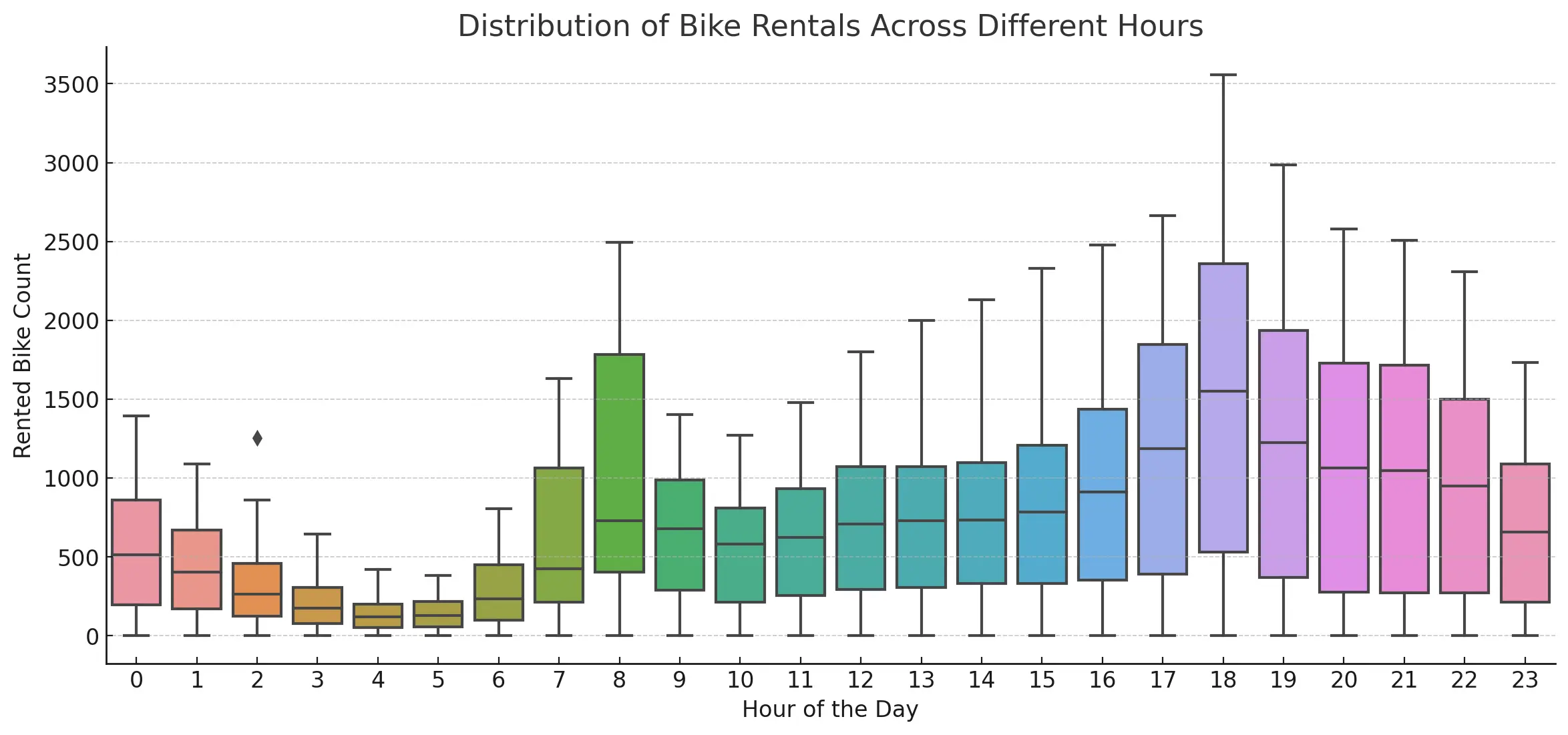
Analysis Report:
- The line plot shows a clear seasonal pattern in bike rentals, with peaks and troughs indicating variations over time.
iii) Correlation Heatmap Of Features
# Correlation heatmap
plt.figure(figsize=(12, 8))
sns.heatmap(data.corr(), annot=True, fmt='.2f', cmap='coolwarm', vmin=-1, vmax=1)
plt.title('Correlation Heatmap of Features')
plt.show()

Analysis Report:
- There is a positive correlation between
Rented Bike CountandTemperature, and a negative correlation withHumidity. Other weather variables also show correlations with bike rentals.
4. Developing Hypothesis Questions
Creating hypothesis questions is crucial for guiding your analysis and discovering deeper insights. Here is a structured method to think about and develop these questions:
Step 4: Creating Hypothesis Questions
To formulate hypothesis questions, start by considering what factors might influence the data. For bike rentals, think about how time, weather, and events could impact rentals.
- Trend Analysis:
- How do the daily bike rentals trend over the months?
- What are the peak hours for bike rentals throughout the week?
- Is there a significant difference in bike rentals between weekends and weekdays?
- Seasonal Patterns:
- How do bike rentals vary across different seasons (Winter, Spring, Summer, Autumn)?
- What impact do holidays have on bike rentals?
- Weather Impact:
- What is the correlation between bike rentals and temperature?
- How does humidity affect bike rentals?
- How do bike rentals perform on days with high solar radiation versus low solar radiation?
5. Graph Visualization (Hypothesis Questions)
– How do the daily bike rentals trend over the months?
# Grouping by Date to get daily total bike rentals
daily_rentals = data.groupby('Date')['Rented Bike Count'].sum()

# Plotting the daily bike rentals trend
plt.figure(figsize=(14, 6))
plt.plot(daily_rentals.index, daily_rentals.values, label='Daily Rentals', color='blue')
plt.xlabel('Date')
plt.ylabel('Total Rented Bikes')
plt.title('Daily Bike Rentals Trend')
plt.legend()
plt.grid(True)
plt.show()
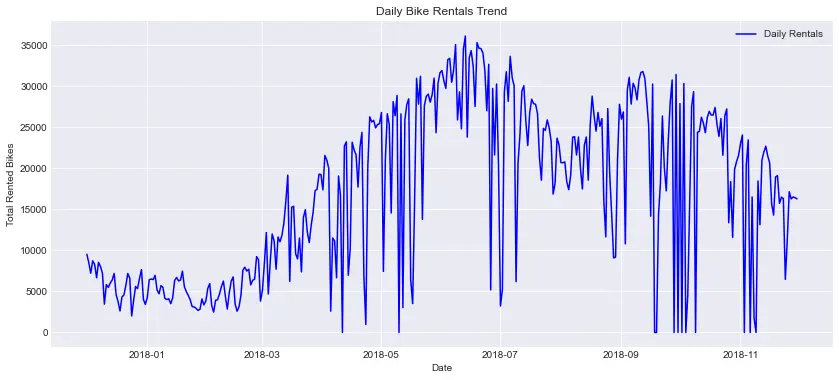
Analysis Report:
- The total number of bike rentals varies significantly day-to-day, indicating different usage patterns.
- Peaks and troughs can be observed, which might correspond to weekdays vs. weekends, holidays, or other events.
– Count of Rented bikes according to weekdays and weekend
# Grouping data by DayOfWeek and calculating the mean rented bike count for weekdays and weekends
weekday_rentals = data.groupby('DayOfWeek')['Rented Bike Count'].mean()

# Plotting the mean bike rentals for each day of the week
plt.figure(figsize=(12, 6))
sns.lineplot(x=weekday_rentals.index, y=weekday_rentals.values, marker='o')
plt.xlabel('Day of the Week')
plt.ylabel('Average Rented Bikes')
plt.title('Average Bike Rentals by Day of the Week')
plt.xticks(ticks=range(7), labels=['Monday', 'Tuesday', 'Wednesday', 'Thursday', 'Friday', 'Saturday', 'Sunday'])
plt.grid(True)
plt.show()

Analysis Report:
- Peak Day: Friday has the highest average bike rentals.
- Lowest Day: Sunday has the lowest average bike rentals.
- Weekdays vs. Weekends: Weekdays generally have higher rentals compared to weekends, with a noticeable dip on Sunday.
– What are the peak hours for bike rentals throughout the week?
# Grouping data by Hour and calculating the mean rented bike count for each hour
hourly_rentals = data.groupby('Hour')['Rented Bike Count'].mean()

# Plotting the mean bike rentals for each hour of the day
plt.figure(figsize=(12, 6))
sns.lineplot(x=hourly_rentals.index, y=hourly_rentals.values, marker='o')
plt.xlabel('Hour of the Day')
plt.ylabel('Average Rented Bikes')
plt.title('Average Bike Rentals by Hour of the Day')
plt.grid(True)
plt.show()
Analysis Report:
- Morning Commute: There is a significant peak in rentals around 8 AM, which aligns with the morning commute.
- Evening Commute: The highest rentals are observed between 5 PM and 7 PM, corresponding to the evening commute.
- Night Usage: Rentals drop significantly after 8 PM, with a small decline continuing into the early morning hours.
– How do the average hourly bike rentals differ between holidays and non-holidays?
Analysis Report:
- Commute Times: Non-holidays show distinct peaks during morning and evening commute times, indicating regular workday patterns.
- Holiday Patterns: Holidays have a more evenly distributed rental pattern throughout the day, with slightly fewer rentals in the early morning and late evening.
– How do the average hourly bike rentals vary across different seasons?
# Point plot for Hourly Bike Rentals with Seasons as hue
plt.figure(figsize=(14, 7))
sns.pointplot(x='Hour', y='Rented Bike Count', hue='Seasons', data=data, palette='viridis')
plt.xlabel('Hour of the Day')
plt.ylabel('Average Rented Bikes')
plt.title('Average Bike Rentals by Hour with Seasons as Hue')
plt.grid(True)
plt.show()
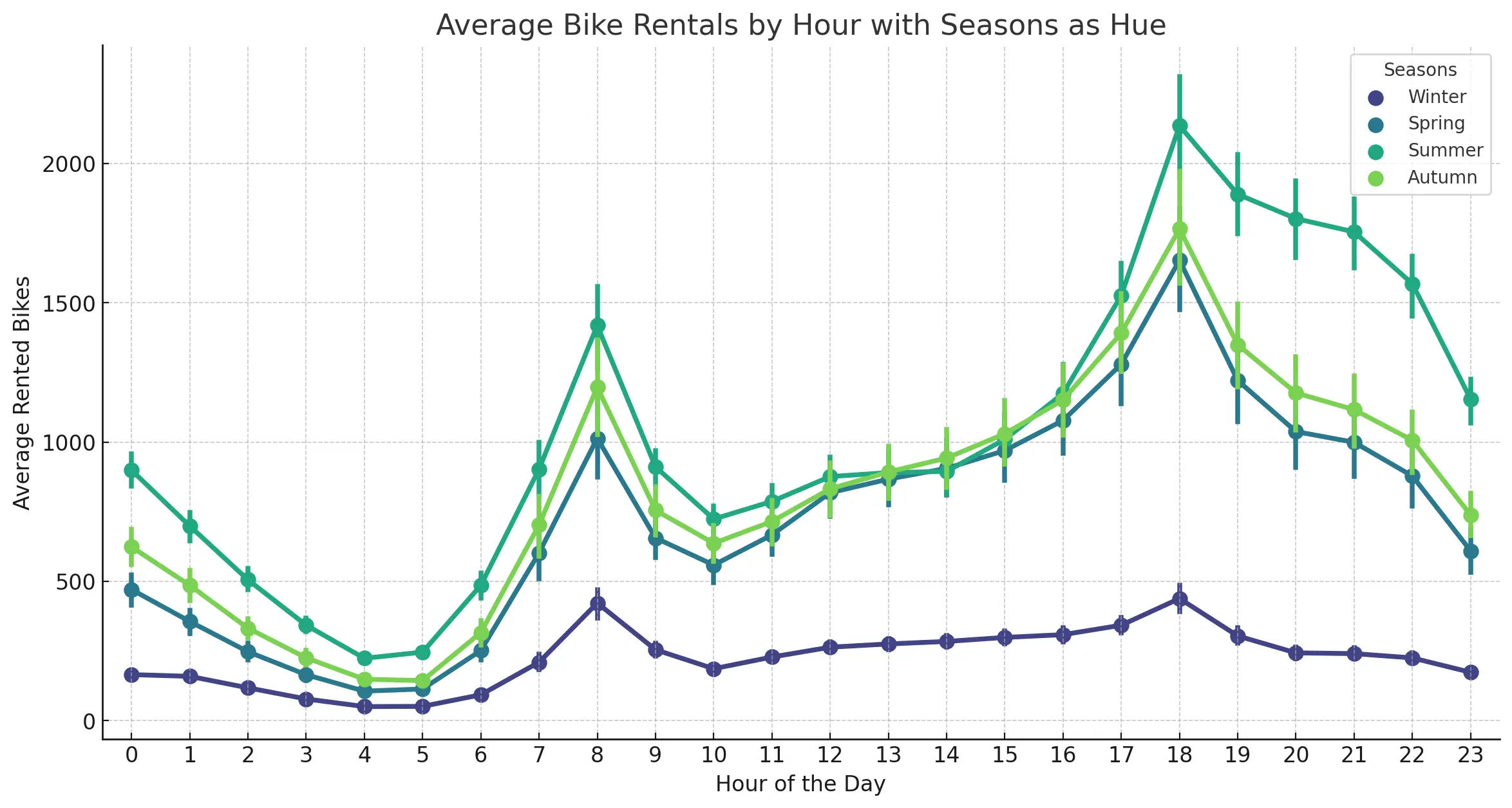
Analysis Report:
- Summer: High demand during both morning and evening hours, suggesting favorable conditions for biking.
- Winter: Reduced activity possibly due to cold and unfavorable weather conditions.
- Spring and Autumn: Balanced usage, making it a stable period for bike rentals.
6. Developing Key Performance Indicators (KPIs)
KPIs are crucial for measuring the success of your business strategies. Here’s how to develop effective KPIs:
Step 5: Defining KPIs
KPIs should be aligned with your business objectives. For bike rental companies, KPIs could include average rentals, peak rental times, and the impact of weather conditions.
- Overall Bike Rentals:
- Total number of bike rentals in the given time period.
- Average number of bike rentals per day.
- Hourly Rentals:
- Average bike rentals per hour.
- Hourly distribution of bike rentals across a typical day.
- Seasonal and Monthly Performance:
- Total number of bike rentals per season.
- Monthly breakdown of bike rentals.
- Weather-Related KPIs:
- Average bike rentals on days with temperature above/below 15°C.
- Average bike rentals on days with high (above 60%) and low humidity.
- Average bike rentals on days with high (above 1.0 MJ/m²) and low solar radiation.
Note: As this is a long blog, I will cover the KPI implementation in an upcoming blog.
Hope, after reading this complete blog, you now understand how to create Hypothesis and KPI questions and why they are important.
7. Conclusion
By performing a detailed time series analysis, bike rental companies can gain valuable insights into their operations and customer behavior. This enables better decision-making and more effective resource management. By starting with data collection and preparation, performing exploratory data analysis, formulating hypothesis questions, and developing KPIs, businesses can unlock the full potential of their data and drive growth. Here is a Real-Time Weather Application project.
I hope you learned a lot from this blog. Feel free to ask your valuable questions in the comments section below.


